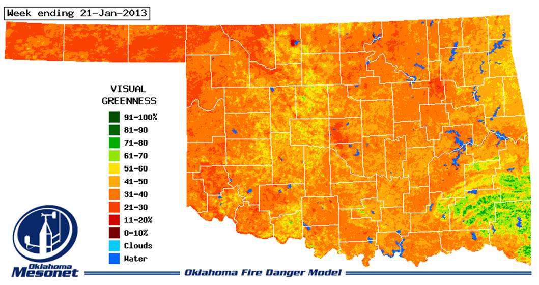
I thought I would share a couple of visual greenness maps sent to me by JD Carlson in Biosystems and Ag Engineering. These are from the Oklahoma Mesonet fire danger model site and provide a visual estimate of green vegetation for mid January 2012 (top) and 2013 (bottom). Note the stark contrast in greenness throughout the wheat belt of western Oklahoma. As indicated in the 2013 map, there are some small pockets of wheat with ample stands and average yield potential, but these are not large enough to make up for all of the red.
- Comment
- Reblog
-
Subscribe
Subscribed
Already have a WordPress.com account? Log in now.
